Healing
Track
A clinically proven chronic-pain therapy, no product, and one part-time designer. Under six months later: a real patient at a real clinic, and an off-roadmap AI coach the founder demos to investors.

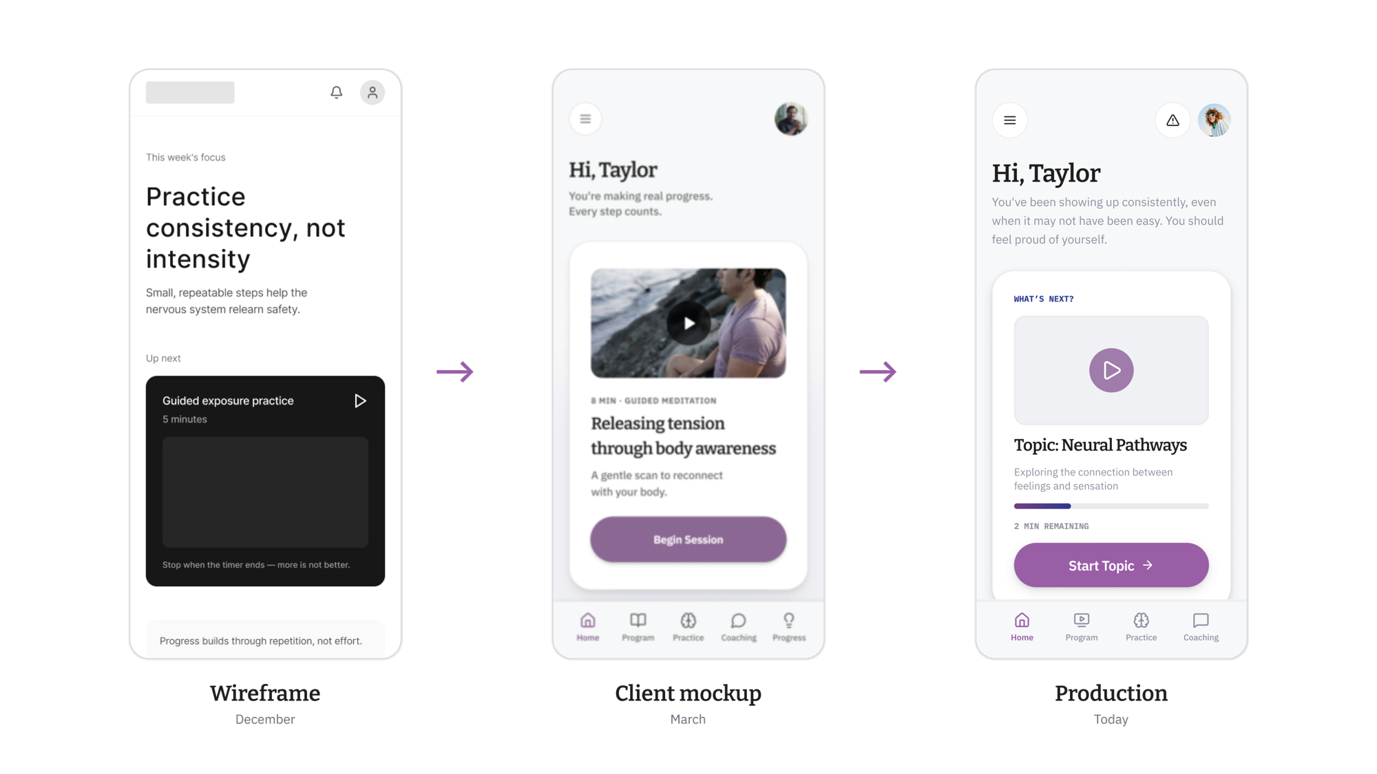
Healing Track was a healthcare startup with a clinically proven therapy for debilitating chronic pain, market momentum from its founder's book, and no product. The design they brought in wasn't working, and, credit where it's due, they said so out loud. The mandate from their CPO, a returning client: we don't want to build something we need to scrap.
The shape of the project was the hard part. The research was excellent, and therefore it kept talking. Every round of interviews changed the product. Design was one person, part time, on a product that refused to sit still, for users in real distress, where a wrong tone doesn't just lose engagement. It loses trust in the therapy itself.
Designed. Redesigned.
Redesigned again.
On purpose.
The traditional posture, design it once and defend it, would have died in week two. So the process got built around redesign. Gray-box wireframes generated from the research personas went to the client as three full directions while changing them cost nothing. They killed two. Strategy got decided at the cheapest possible fidelity.
Start in the codebase.
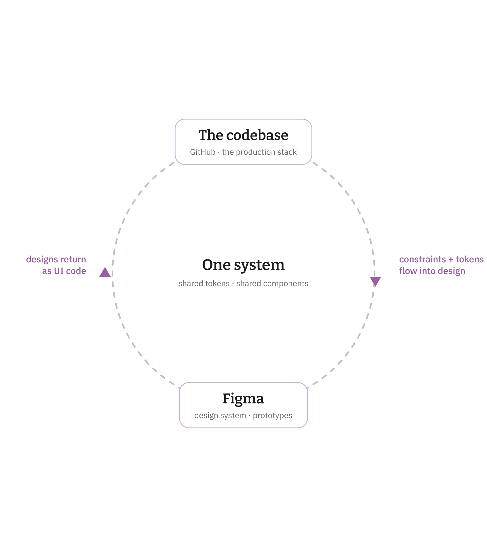
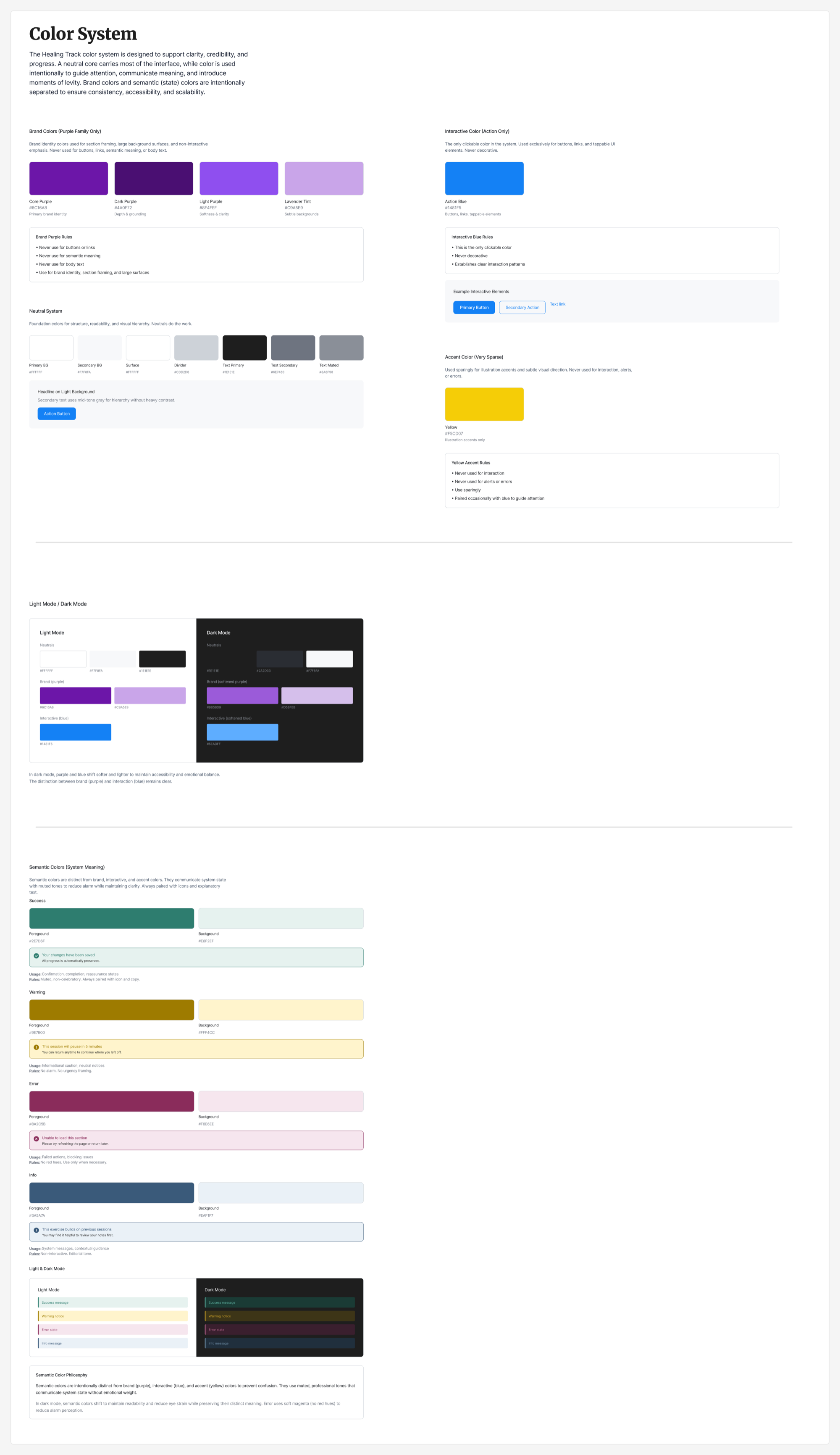
You know how this usually goes. Design spends three months building a cathedral in Figma. Engineering looks at it, sighs, and builds a different cathedral out of the parts they actually have. Two sources of truth, both lying. We skipped it. I opened the repo first and built the design system out of what was already true: the structure, the components, the tokens, the real constraints. Every design decision came out speaking production's language.
Then it flows back. Through the Figma and GitHub loop, designs returned to the team as working UI code, and the developers picked things up as they landed. No handoff ritual, no translation loss. 208 components, light and dark. One system, seen from two sides. Development never waited on design. Feasibility wasn't a phase on this project. The design system was born inside the constraint, so every screen arrived pre-approved by reality.
Six relationships to pain.
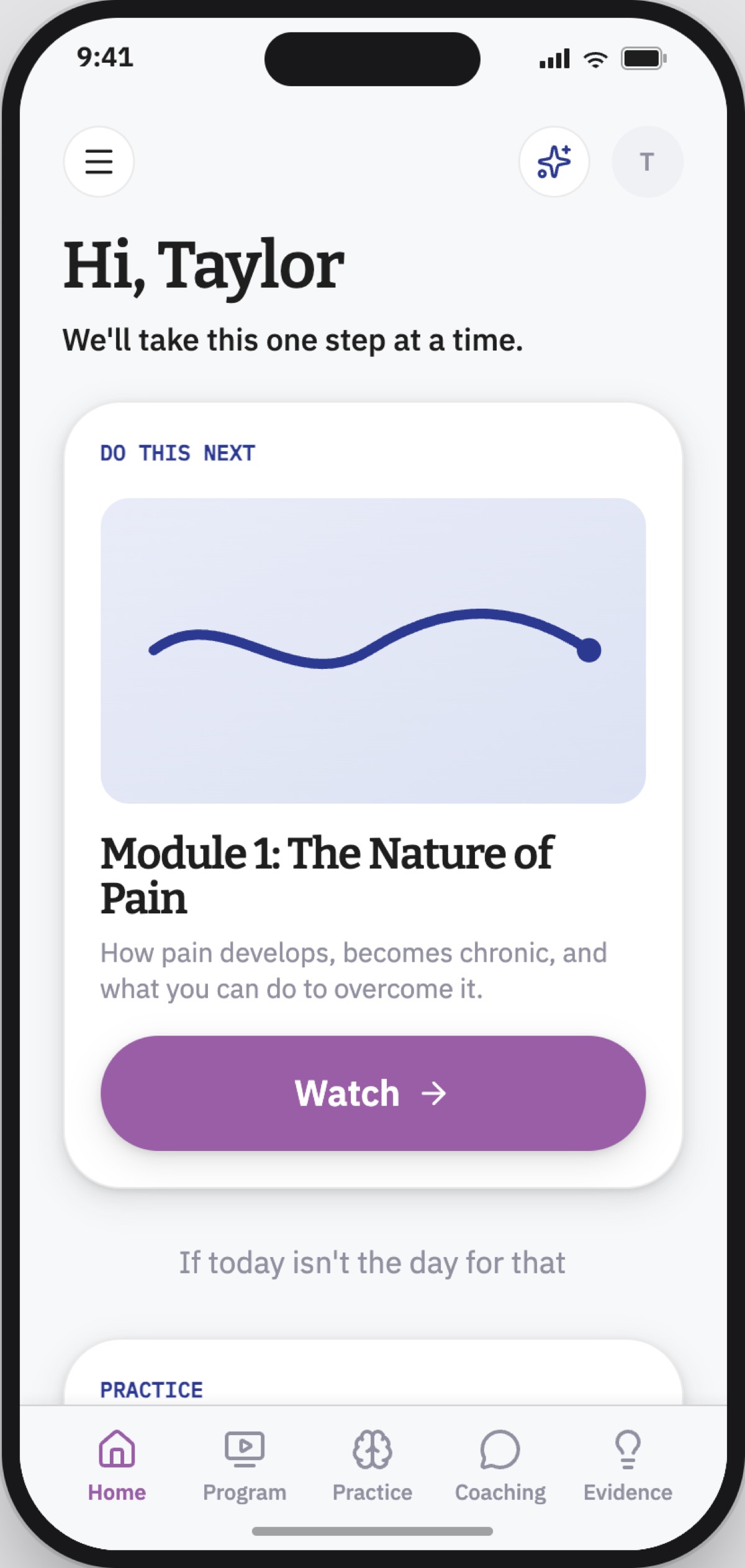
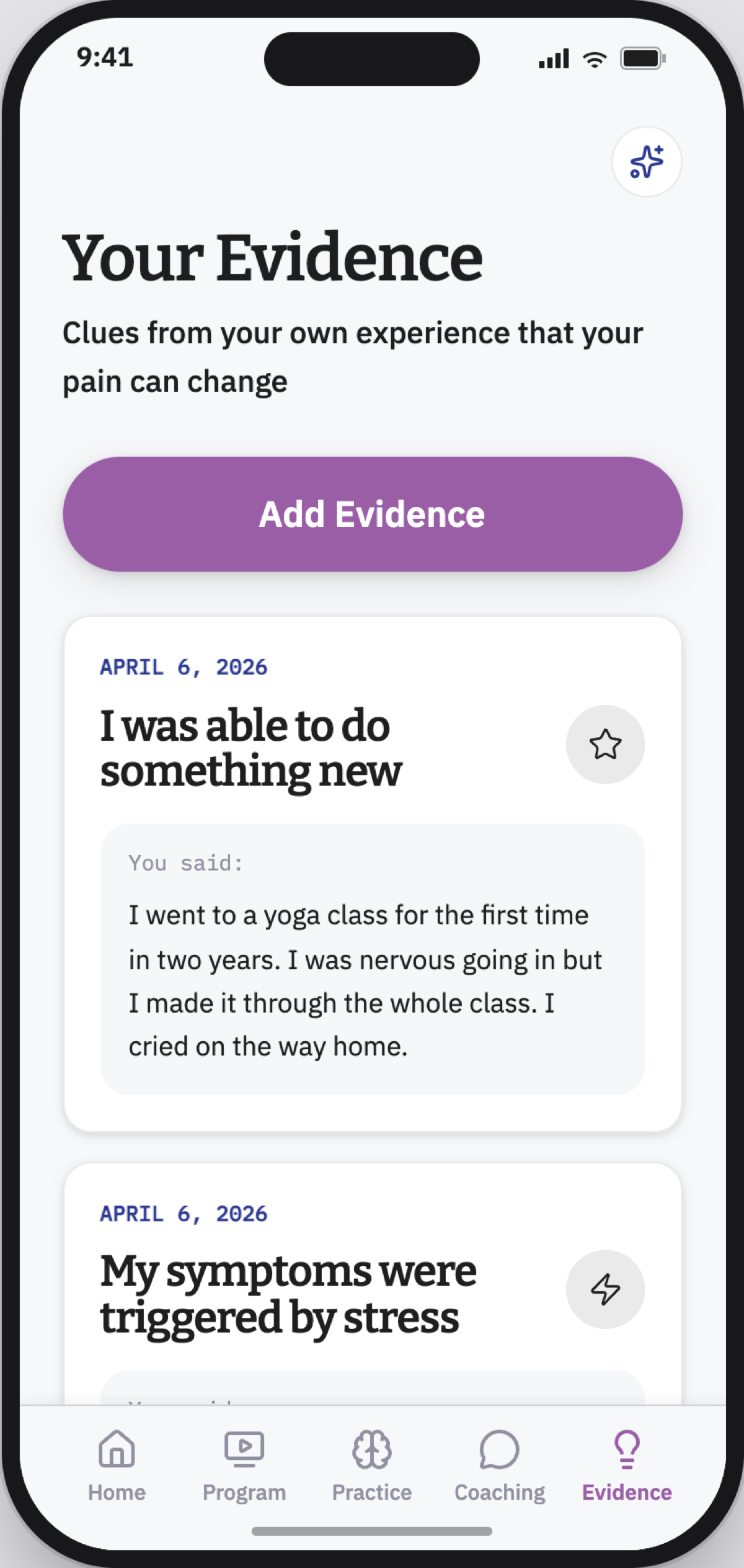
Chronic pain doesn't produce one kind of patient. The research gave us six, and they need different things from the same app, organized on one axis: push toward content, or permit rest. The Rational Skeptic gets evidence and momentum. The Struggling Navigator gets one step at a time and nothing else, because a full plate is exactly what they can't handle. This is what desirability means when your users are in pain: not what tests well in a survey, but what each of these six people can actually face on a bad day.
And the Steady Endurer, the person who would white-knuckle the program to the end and call it fine, gets something almost no app offers: it stops asking. You've done enough today. Rest counts as progress. The only button on the screen says "Done for today." That's what personalization means on this product. It isn't polish. It's the difference between six kinds of people coming back tomorrow or deleting the thing.
None of it is affordable if every variant is handmade. The pipeline is what made being personal cheap.
A demo settles arguments.
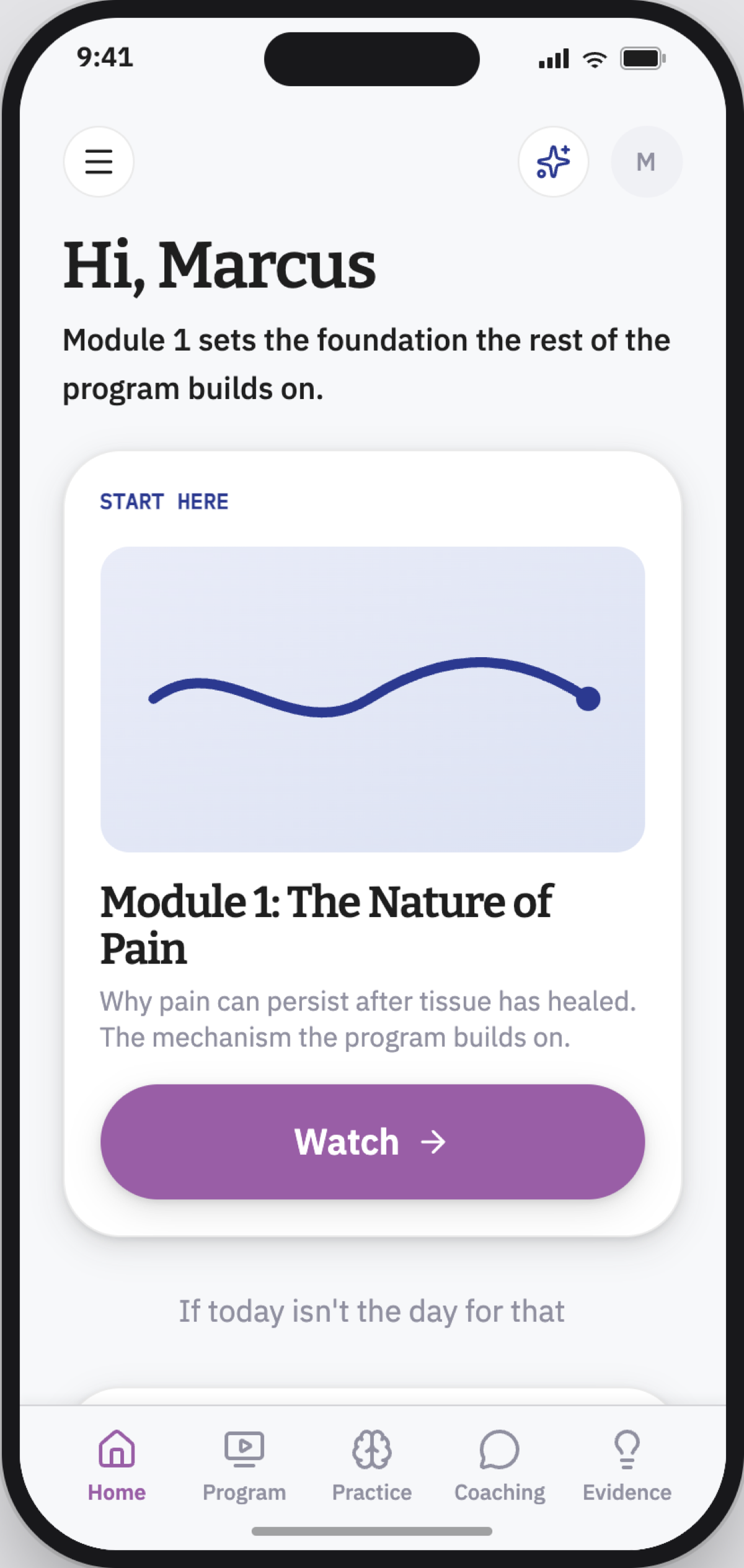
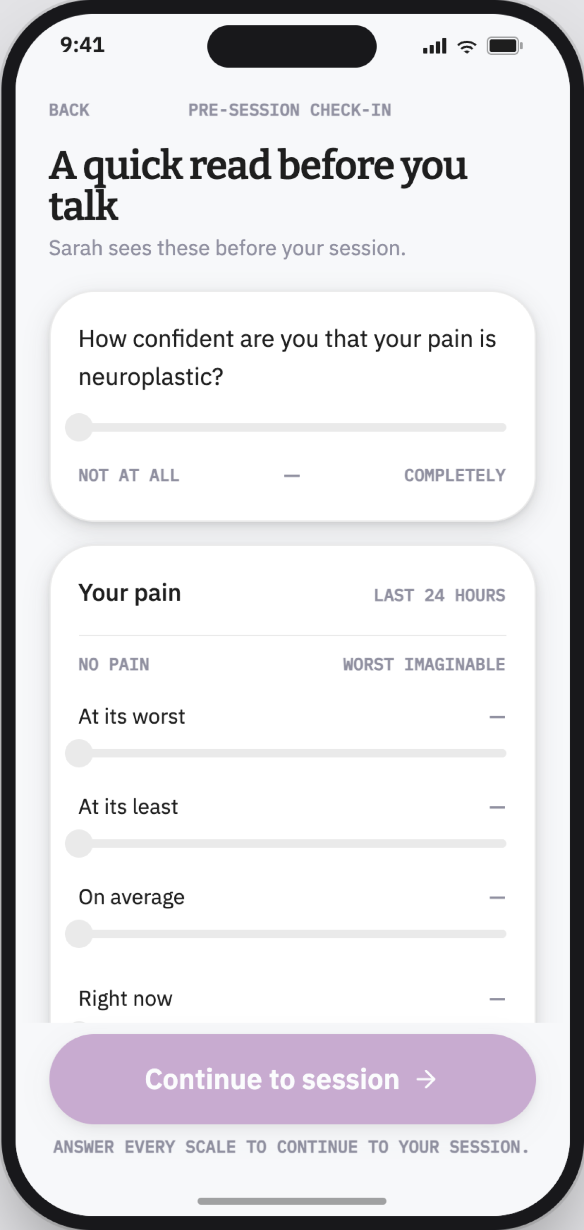
An AI coach was not on the roadmap. Nobody asked for one. I built it anyway, because a working demo settles arguments a slide deck never will. What went into it matters more than how fast it went: the founder's book, seventeen real coaching sessions, and recorded conversations became a written-down coaching model where every rule traces back to something a real therapist said to a real patient. Which analogies land with which people. When somatic tracking is safe, and when it isn't. The bot doesn't sound like a language model wearing a healthcare costume. It sounds like the coaching.
Two days from spec to working app, because the hard part, knowing what a good coach actually says, was already done. Then the escalation: the demo moved our own team from "that's not what this product is" to shipping AI chat as a product feature. The founder asked for a recording, then swapped the wireframes in his own pitch deck for our designs, then started demoing the coach to investor funds himself, live.
One honest tension ran under all of it, and it's the viability question in its purest form. Investors look at an AI coach and see the margin story: automation, scale, support that doesn't grow headcount. Patients told us, over and over, that the human coach is why they trust the product. We let the research set the rules instead of splitting the difference: the bot earns personalization only from what a patient actually did and shared, routes the deep work back to the human coach, and carries an explicit anti-engagement rule. Never encourage use for its own sake. The restraint turned out to be the thing investors liked most once it was walked through, because it's what actually lets a small coaching staff carry a growing patient base.
First patient, July 8
Launched at the Pain Psychology Center, the clinical home of the therapy. In the client's words, a week earlier than she was planning.
"I love the prototype!"
The client, in Slack, in May. The best part came right after the compliment: a list of change requests, turned around the same day.
Never the bottleneck
Through every redesign, design was not once the reason anybody waited. That was the entire point of the method.