Archa
A CRM refresh that turned out not to be a UI problem. Reframing the brief into a platform restructure produced 20-30% more advisor calls, 25% faster onboarding, and an organization that changed how it valued design.
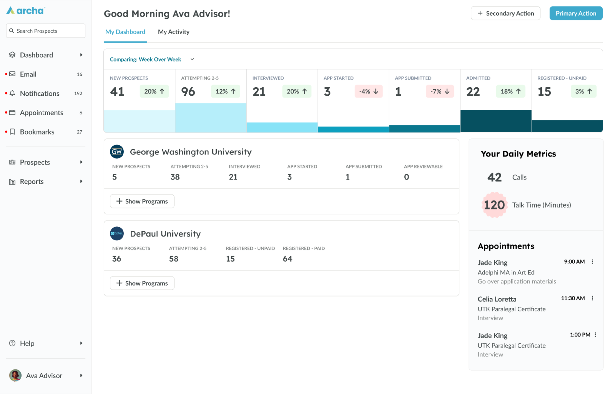
Archa is the operational hub of a higher-education enrollment business. Advisors, administrators, and marketers all live in it: tracking prospects, logging calls, supporting students through complex, high-stakes enrollment decisions. It had breadth and no depth. One experience served three very different jobs.
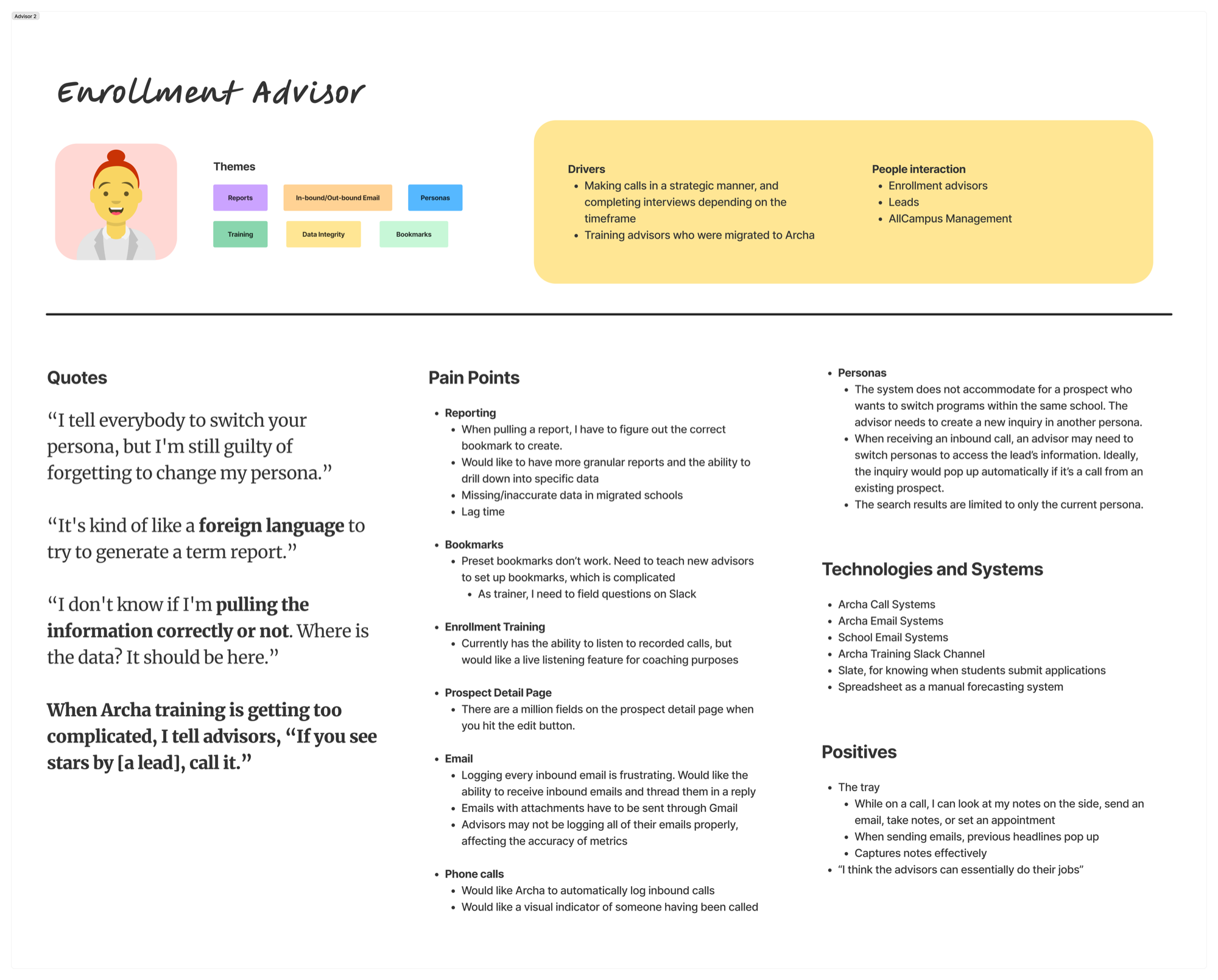
So advisors pieced together a student's status from memory and open browser tabs before calls where trust gets won or lost. Admins exported to spreadsheets to answer basic performance questions. As one enrollment advisor put it: "If I don't know the exact start date of a program, I can't even filter my prospects. I end up guessing or pulling reports from somewhere else."
My role changed as the engagement did. Early on I did the work myself: research across every role, the service blueprint, design direction. As it scaled, I directed it, and mentored an early-career designer from research synthesis to presenting design work herself. I know the temptation on engagements like this. Ship the mockups, take the win, let the platform stay someone else's problem. We didn't do that, and it's the whole reason this one worked.
The redesign
wasn't a UI problem.
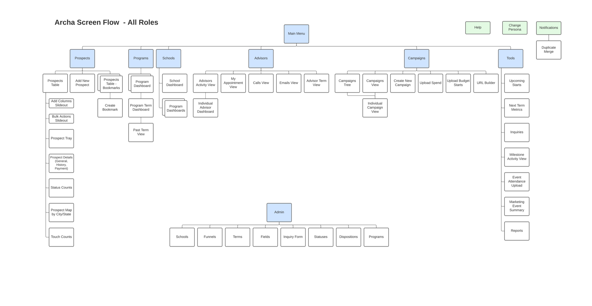
Early designs proved a cleaner, role-aware interface was possible, and also that it wasn't buildable. The Identity Access Management model underneath couldn't deliver different experiences to different roles at all. Feasibility wasn't a checkbox here; it was the finding. Instead of treating it as somebody else's blocker, we made IAM reform the design recommendation and defined the solution with product and engineering. That decision unlocked role-aware design as a platform capability rather than a mockup.
Diagnose, then design.
The engagement started with people, not screens: stakeholder interviews across enrollment, marketing, admin, and leadership, mapped into a service blueprint of user journeys, backoffice systems, and internal handoffs. Three findings shaped everything. Advisors ran a high-volume, time-sensitive workflow without context. The system was rich in data but poor in visibility. And the platform treated all users equally when their jobs demanded the opposite. That research is the desirability case in this project: nobody had asked the people inside the tool what the tool was costing them.
Interactive prototypes became the alignment instrument. Simulating real tasks, filtering prospects, logging calls, navigating appointments, they gave siloed departments the same artifact to react to. Advisors saw their ideas land in the interface; directors aligned on priorities in front of it. "The prototype made me feel like, for the first time, the system was being built around how we actually work," an enrollment manager told us.
Alongside the structural work we shipped what the blueprint justified: a redesigned advisor dashboard, streamlined filters and tray views, standardized terminology, and a shareable bookmarking system. Targeted improvements, no total rebuild. That last clause was the viability constraint the whole engagement lived inside, and honoring it is why the recommendations got funded instead of filed.
Design with, not just for.
Throughout the engagement I mentored an early-career designer, guiding her through research synthesis, UI design, and stakeholder communication until she owned key deliverables and presented design work herself. That was deliberate capability-building on both sides: our team got stronger, and the client saw what design maturity grown from within looks like.
The engagement's value concentrated at two moments that had nothing to do with screens: recognizing that the IAM model, not the interface, was the real blocker, and choosing to grow a designer rather than just deliver around her. Both are direction decisions. The screens mattered, but they were the receipt, not the work.
20-30% more calls
Advisor call volume rose with clearer prospect data and workflows. Client-reported early outcome, measured post-launch.
25% faster onboarding
New advisors reached productivity a quarter faster on simplified navigation and a more focused UI. Client-reported early outcome.
Design as a lever
Cross-functional product teams formed during the engagement persisted, and leadership backed continued investment in human-centered product work.